
I’ve just begun the process of redoing my bathroom working with a designer. Yesterday in an email as were talking about tile colors, I fessed up that I’m going to be one of those high maintenance clients that will want to be all hands on the color picking. Knowing that I’m a yarn dyer, she pretty much saw it coming.
Now granted, I haven’t always been too confident about my color choices. When I was a graphic designer, I was usually was handed a set of company’s corporate colors that I needed to work with.
But once I started designing craft books I had to come up with some of my own color theory’s pretty quickly to keep the designs fresh and current without being too average.
Here’s the thing, I’m not just talking about pulling out the color wheel and put one in applying some standards. That would mean everyone is dyeing the same stuff.
When creating colorways be it for a stranded sock, dyeing yarn or freeform crochet, it is important to set up some rules of thumb that work FOR YOU to achieve a colorway that you can stand behind.
So here’s some tips I have learned on shaking up traditional color theories and expressing yourself with color.
Rather then think of a visual concept, consider an emotional response that you want from your visuals.
For example, it is not necessarily just the colors of your garden you want to capture, but the cheery bright emotions you feel when you see those colors. Thinking in terms of emotion will take your colors to the next level. What colors would convey light giggle happy with a touch of melancholy. Regal through darkness. Ancient wisdom of the future. Steampunk rainbows.
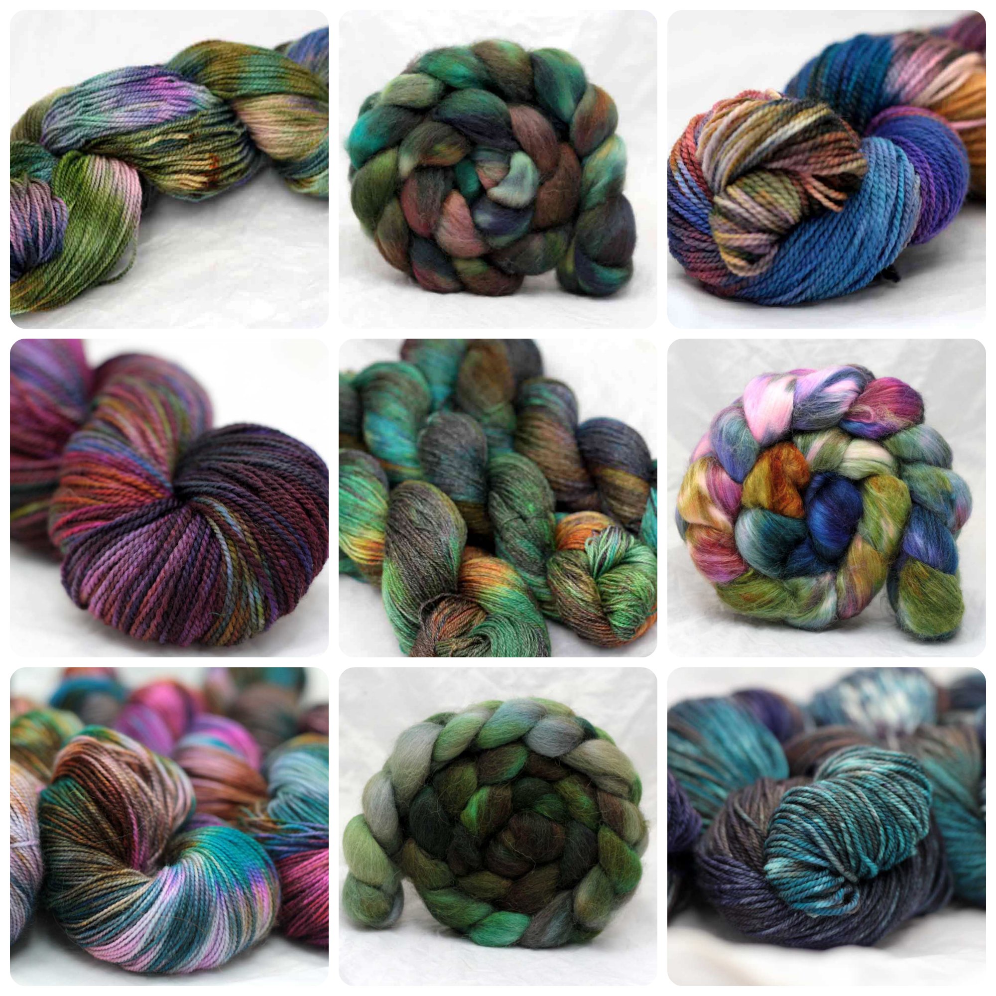
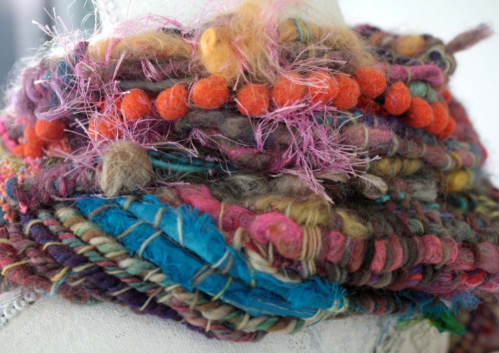
Start with your favorite color. For me it has been a lot of deep turquoise blue.
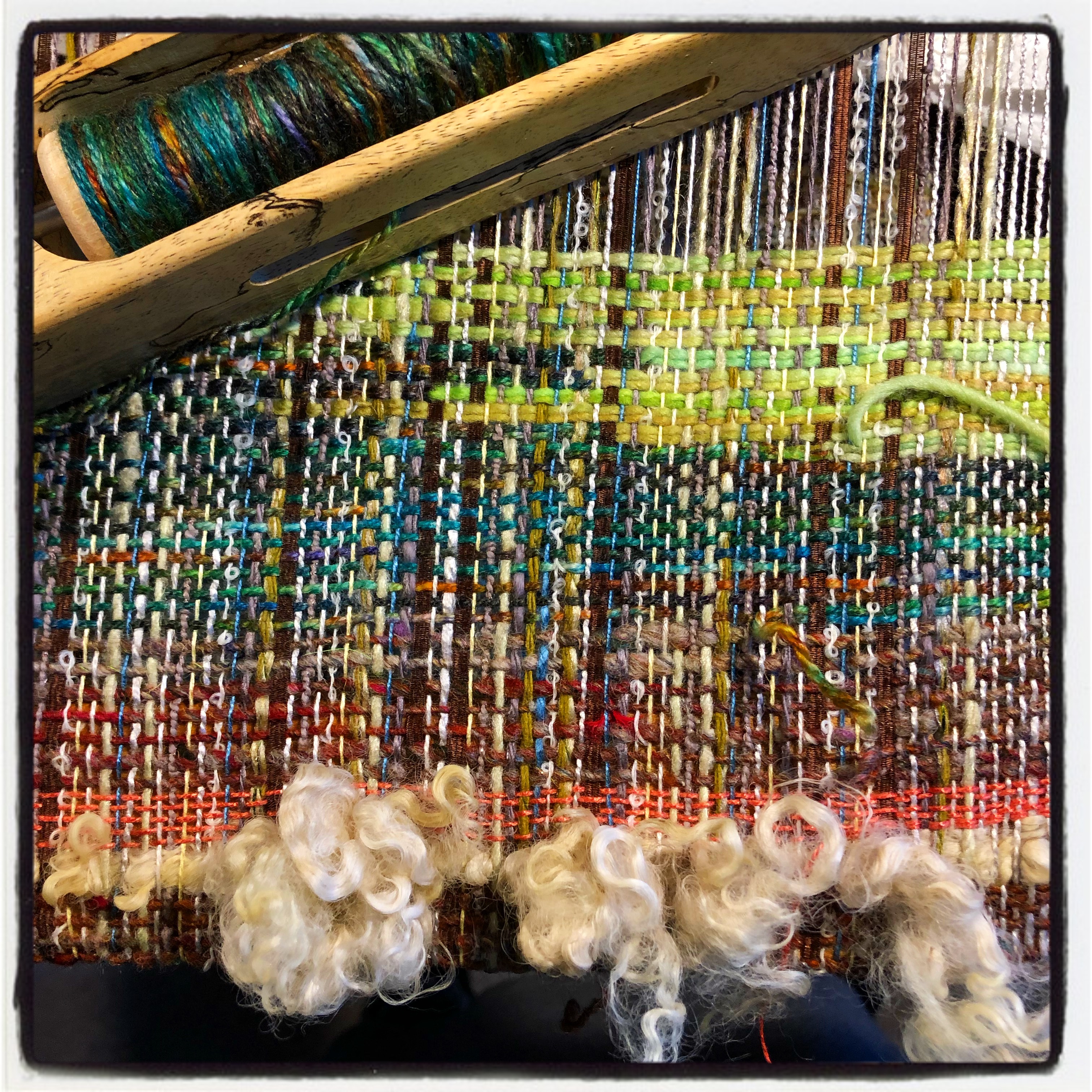
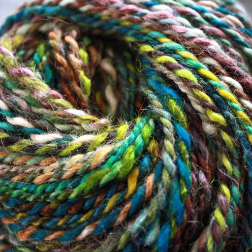
Add one or two pleasing combinations… my go to combinations for deep turquoise are cobalt, purple, chartreuse, teal, steel grey
Think of what the complementary color would be for your favorite color and look at a series of 4 or 5 colors that are within close range. For example that turquoise blue color that I love love love. Now the complementary of that would generally be a reddish orange. But what if I took different shades of that orange and maybe went more golden. Or lighter, like an adobe beige. Or more towards a deep golden brown. Look at a full range this complementary color will make your favorite color pop in comparison. Pick one or two of them.
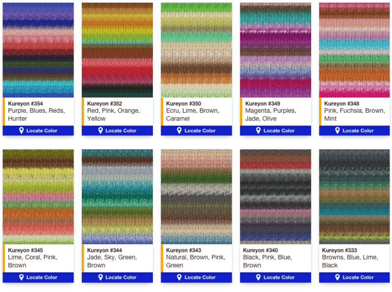
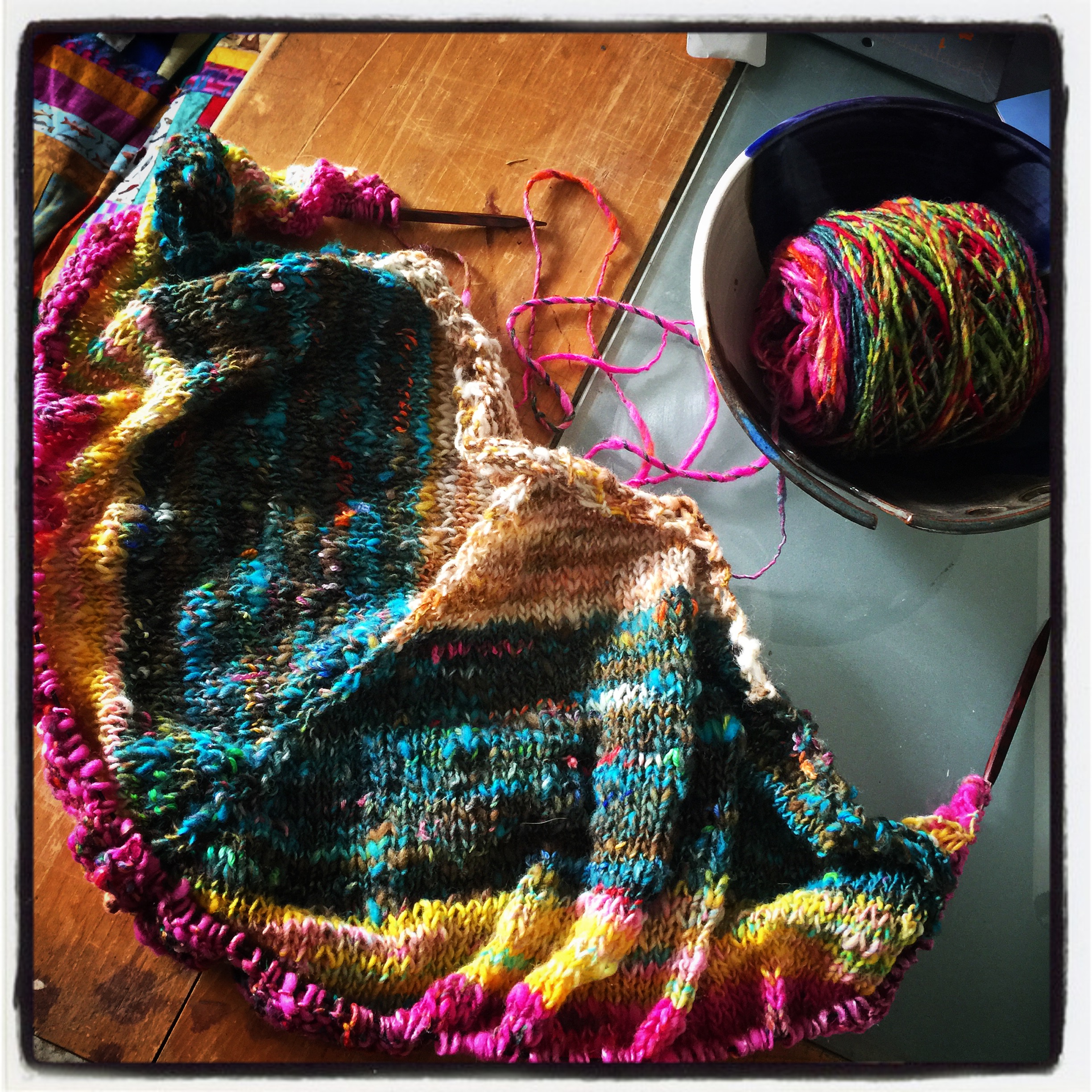
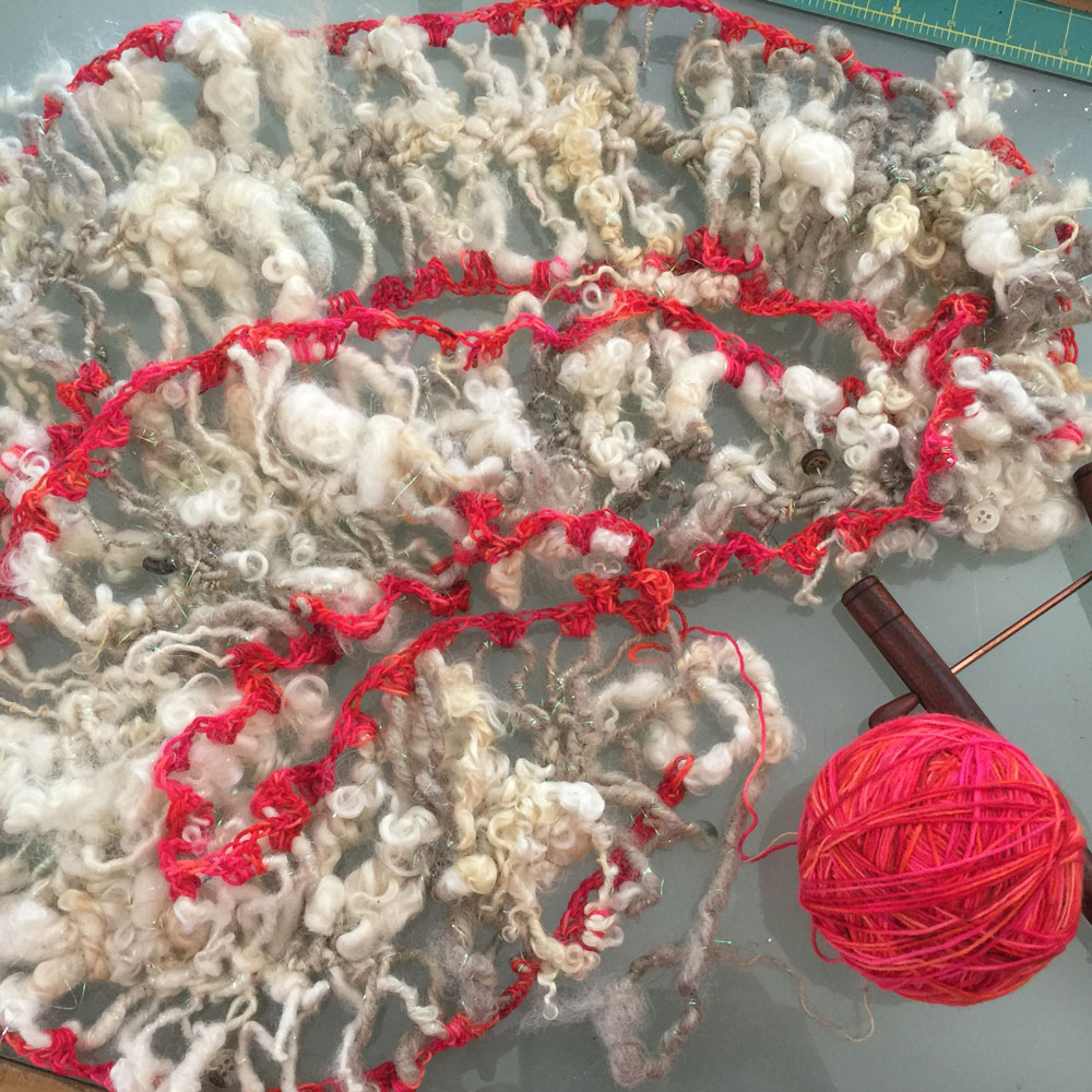
Throw in a wildcard. One of my all-time favorite yarn brand is Noro. Did you ever notice and every single color way is has something not quite harmonious going on? There’s always that one color that you think you’re on the edge of cutting out of the yarn. For example, harmonious blues and greens might be punctuated with a screaming pink. Or’s a soft warm pallet of reds punctuated by a deep dark inky black. It’s often that tension of that one color that makes the harmonious colors standout. Play with the contrast of adding a wild card to your palette. Sit with the discomfort for a little bit, you might be surprised. That wild card color might be the one thing to add that little bit of edge to your colorway.
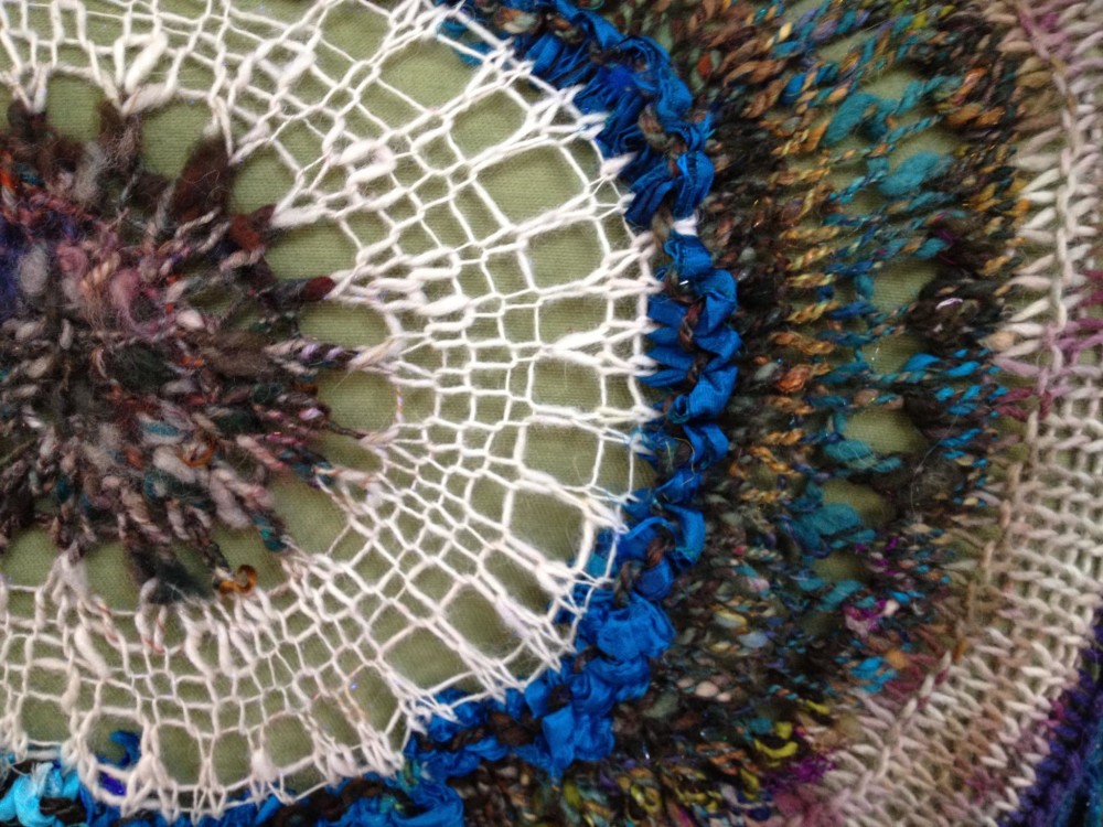
Make sure you pick a series of different values. Value is the general lightness or darkness of a color. If you have a series of colors that are all the same value chances are you’re not going to get as much depth as you want. Line up your colors together. Stand back and squint at your selection. Squinting tends to merge the colors into different values of gray. What you’re aiming for is to have many different values within one color range so some colors are a little lighter and some colors are a little darker. A variety of values will give your piece a lot more depth.
Go with your gut. In the end, it is your gut that will let you know when you have picked the perfect colors or not. Your gut will let you know if you are conveying the right emotional response to the colors you have selected.
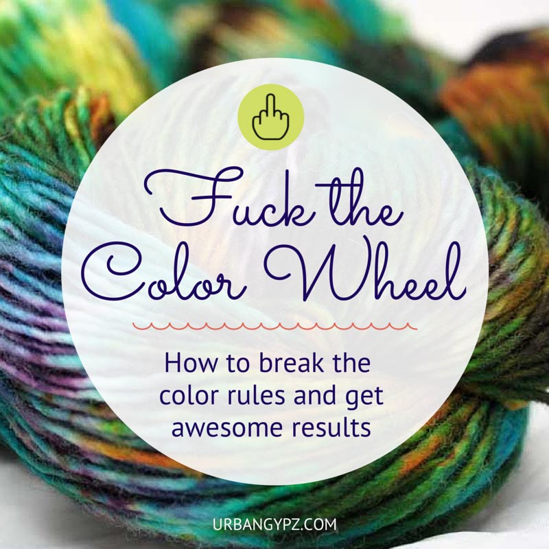
Here is one of my favorite tools for playing with colorways. Nope it is not the Pantone site… I feel the same way about Pantone’s “style” forecasts as I do about the color wheel. Fuck it… go with your gut and your heart.
Sign Up for the UrbanGypZ Fiber Arts Collective
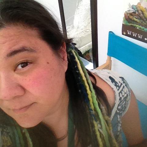
 Fiber artist Stacey Budge-Kamison AKA UrbanGypZ lives and works in Cary NC. She can also be found knitting in public, hammering out her latest e-course at local cafés and spinning yarns in her booth at her favorite arts festivals. A designer at heart, Stacey has decided that her mission is to help fellow knitters, crocheters, weavers and felters embrace their own style and creativity by exploring fiber art as it is a part of their everyday life and helping them embrace the title of artist no matter where they are in their journey.
You are so freaking funny. I struggle so much with color and the color wheel and color theory. Blah! I love your fuck the color wheel attitude! I feel like I can just relax and see what happens. I love reading your stuff. I’m looking forward to February art journal. Actually I’ve never done any art nor journaling so it’s a big stretch. But thank you!
Yay! So glad you found my article helpful. Traditional color theory leaves me so “meh”. Looking forward to having you in the art journal challenge. we are going to have so much fun.
I just loved reading this article! So much makes sense now that didn’t before. I’ve never learnt to love the pick-from-the-colour wheel colourways, they usually leave me cold, without any emotions stirring at all. I’d much rather use a yarn or hand dyed fibre that left me a little bit on edge! Reading what you write always makes me want to do things myself. Thank you!
Yay! Anne. I am so glad my article struck a chord with you. There is just no set formula for making fiber art than to just play make mistakes and follow your heart. If only art schools would teach art beyond the color wheel, because that is where the true creativity begins.
I use the Fuck the Color Wheel way of dying ALL the time. I just go with my gut, always have, always will. Thanks for naming it!
I was “researching” prior to beginning my lessons in dyeing yarns. Almost all the tutos out there said, “..mind the colour wheel, this one compliments with that one…” and so on, and so on.. mostly, not my colour combo preferences. And then, your post title just screams what’s in my head. Ha! Thanks so much. I have more confidence than 15 minutes ago to start this dyeing journey. Wish me luck?
You’ve got this! You go girl
I love everything you post, because you encourage us to be “us”. Not get to heady about it.
I have started this process of weaving and just let myself be – new, open, silly, not know, and just go with my heart and gut.
SO MUCH FUN.
THANK YOU
Right on! Rock on with your rebel self Mo. You are the reason I do all of this. xo
Love this! Thanks.